
Introduction
In the world of data visualization, Donut Charts (or Doughnut Charts) are seen as common alternatives to the Pie Chart for representing data percentages/proportions of a whole. Put simple, Donut Charts are Pie Charts with a hole in its middle. However, Donut charts are not a pre-set feature that is found readily-made in Tableau. This is why I’ve decided to write an article and simple beginner’s tutorial on how to create a Donut Chart in Tableau.
How do I Create a Donut Chart in Tableau?
Here’s how to Create a Donut Chart in Tableau
Create a regular Pie Chart with the data you want to plot with
Include 1 or more dimensions and 1 or 2 Measures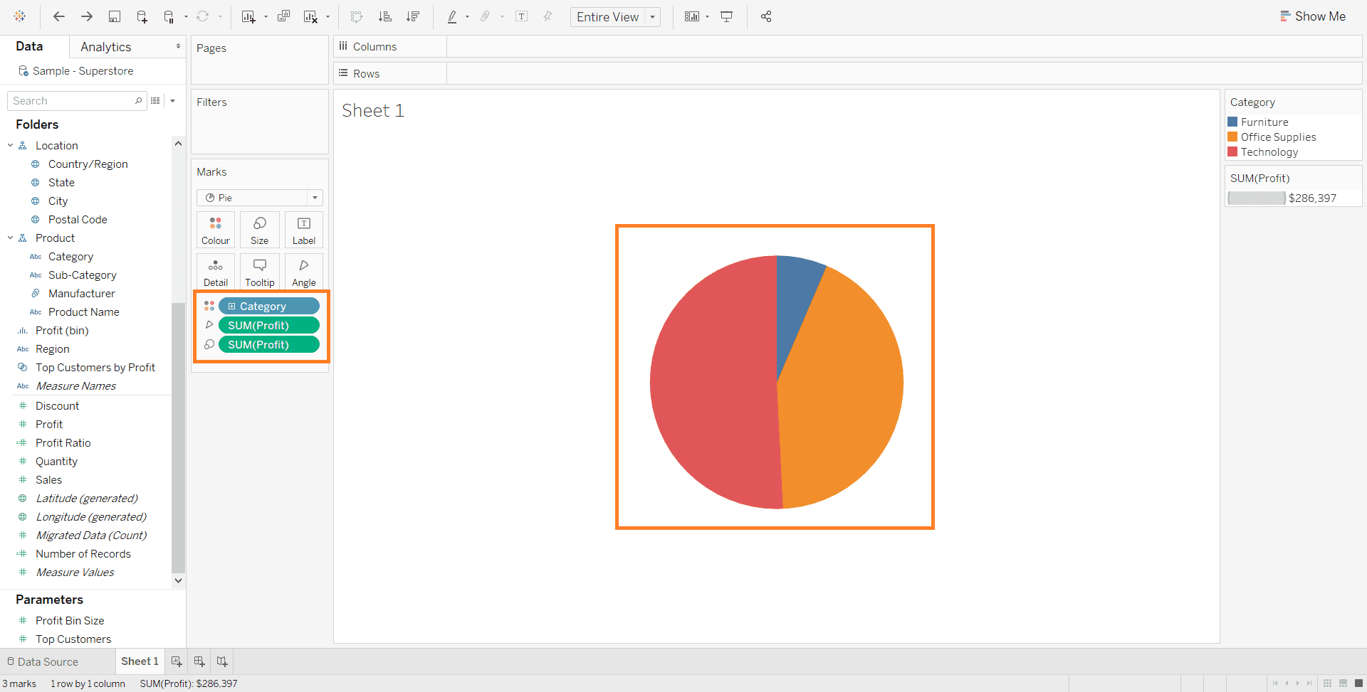
Add an empty circle over the Pie Chart
The empty circle in a Donut chart is used to overlay the original pie chart to achieve a hole similar to that of a donut shape!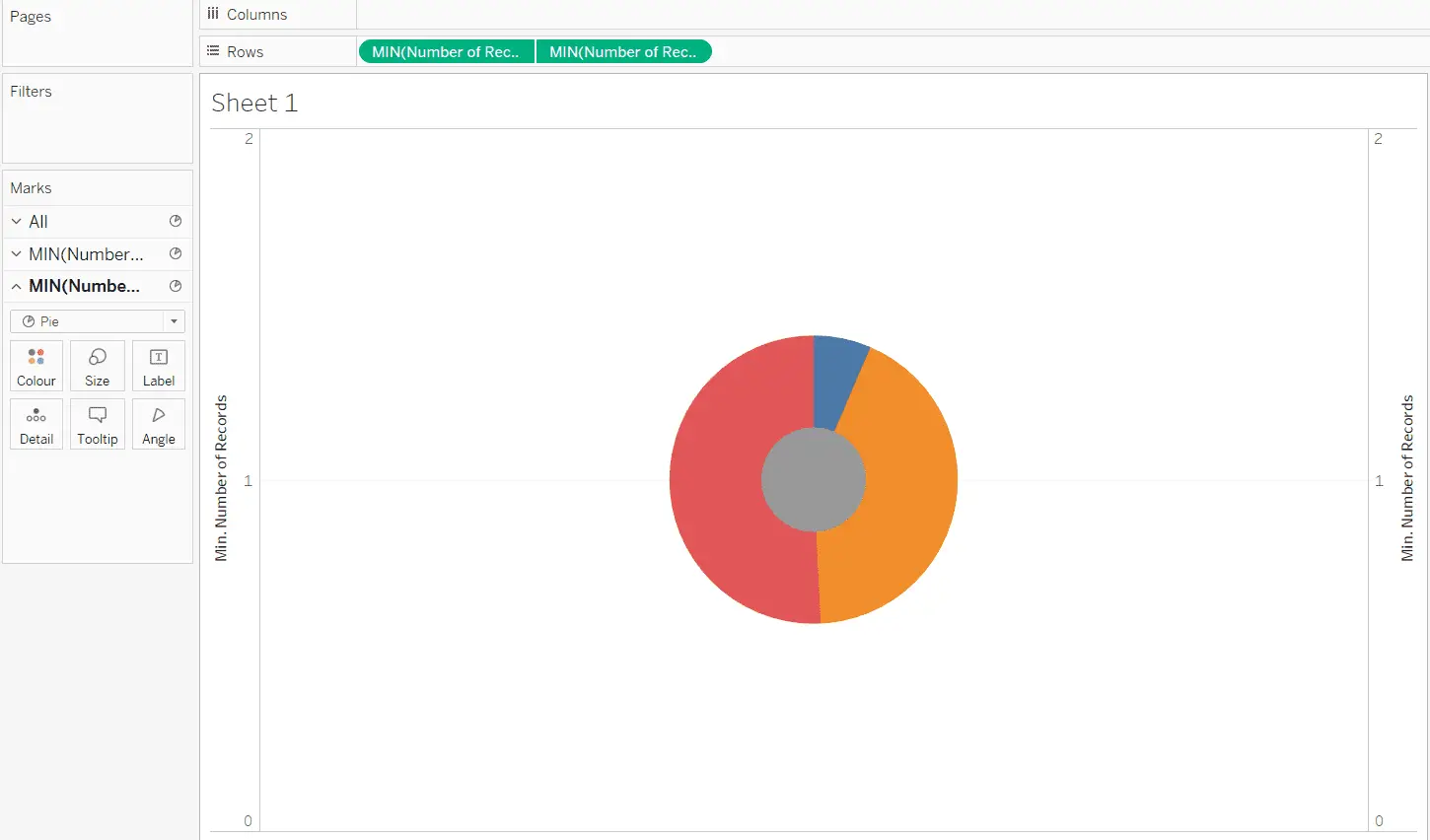
Modify the empty circle
The empty circle, or second donut, has to be resized and formatted such that the two circles are aligned.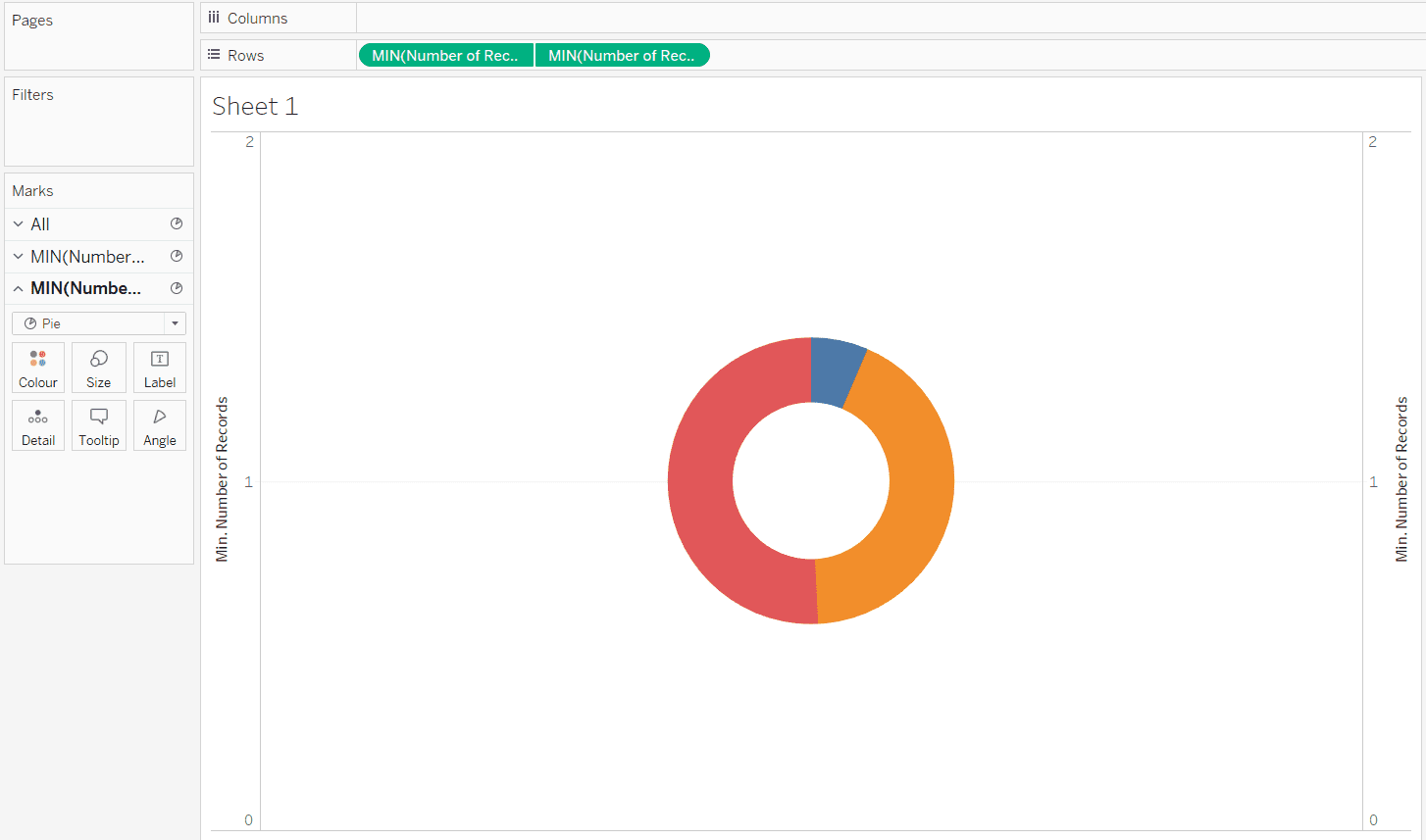
There you have it, a brief introduction on how a donut chart effect can be achieved. Do take note that Donut Charts are not available as an option in the “Show Me” feature of ready-made charts. This is the reason why we have to create a custom donut chart from 2 pie charts. For a more detailed step-by-step guide, you can refer to my instructions below!
Detailed Guide: Creating Tableau Donut Charts
As I’ve mentioned above, Donut Charts are not currently a feature available in Tableau. With a few tweaks and modifications, we can turn our Pie Charts (which are available in Tableau) into Donut Charts that work in a similar manner.
What are Donut Charts?
Donut charts are in many ways similar to Pie charts. They are given the name of “Donut Charts” due to their donut-like appearance, in the form of a ring. Data from different categories are put together in several different “pieces” or “slices” of the “Donut” and “Pie”. They help to visualize the proportions of categorical data, with the size of a “piece” being relative to the proportion of a category.
Tableau Donut Charts – Step-by-Step Guide
In this step-by-step guide, I will be looking at visualizing the proportion of the profit values for various product categories on a Donut Chart. The steps below include detailed instructions and details for you to reproduce a similar result on your Tableau Desktop.
1. Setting up a Data Source
For demonstration purposes, I will be guiding you through the creation process using an in-built data source in Tableau. This is the Sample – Superstore dataset that comes with every Tableau Desktop license. This dataset includes a few dimensions which I will be looking at, which is the product Category and the Profit values of the different categories.
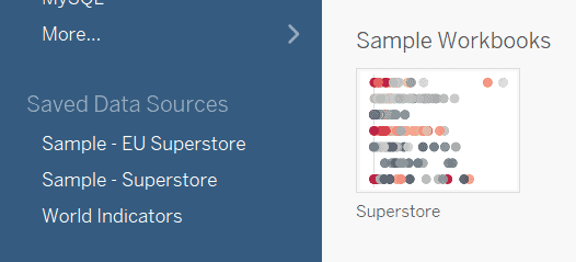
As shown in the screenshot above, the dataset we will be using can be accessed from the data sources left menu panel. Select the Sample – Superstore data source under the Saved Data Sources. Once your data source has been loaded, you are ready for the next step!
2. Create a simple Pie Chart
Up next, we will begin creating a basic Pie Chart, which will work as the base layer for the visualization. Firstly, create a new sheet to prepare a blank sheet where our first pie chart will go to. Secondly, add the categorical data by double-clicking the “Category” dimension or dragging it to the Rows Shelf at the top. Lastly, to add a measure or the Profit values to our chart, double-click the “Profit” measure or drag it to the Marks card. All of the above data points can be found on the left-hand-side in the Data panel.
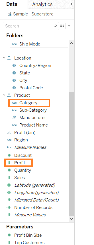
The screenshot above shows the two data points we will be using to construct our first pie chart. These should be available with every copy of the Sample – Superstore dataset.
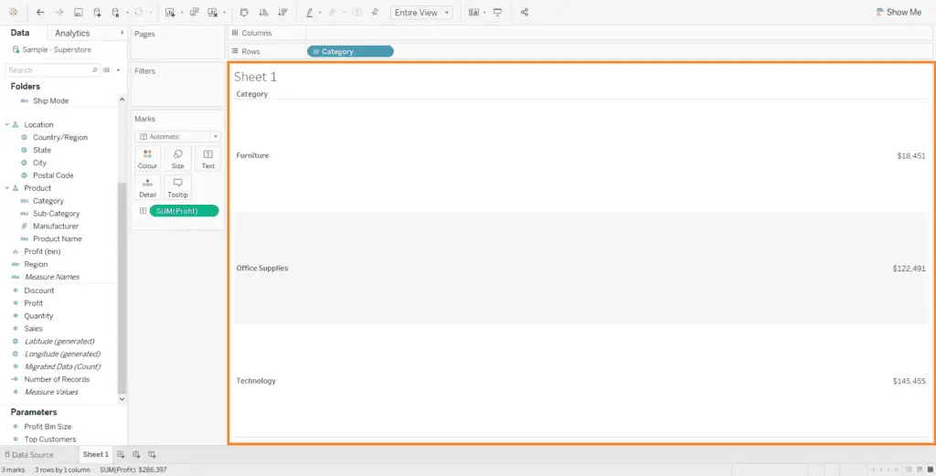
3. Converting data into a Pie Chart
If you have been following closely to the steps, you should be looking at a simple text table generated automatically by Tableau. The screenshot you see below might be what you are currently looking but not to worry, we will be converting it to a Pie Chart.
The text table is Tableau can be converted easily into a Pie Chart using the “Show Me” button on the top-right of your interface. This is a quick yet powerful way to convert visualizations without any manual adjustments. Click on the Show Me button to open up a dropdown menu of charts. This menu shows us all the possible chart we can plot our data with. Charts that are greyed out are not available for the data we currently have. In this example, select the Pie Chart visualisation (the one with a circle and 4 colored pieces).
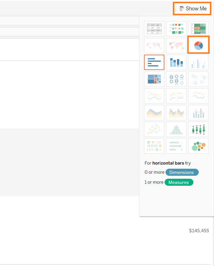
Once you have chosen the Pie Chart, you should end up with a basic pie chart, representing our categorical data and their respective profits!
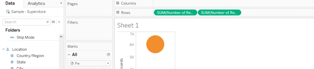
4. Create a second Pie Chart
To achieve an effect of a hole for our donut, we will be creating a second pie chart that will be filling that hole. Firstly, drag the “Number of Records” measure to the Rows shelf from the data panel.
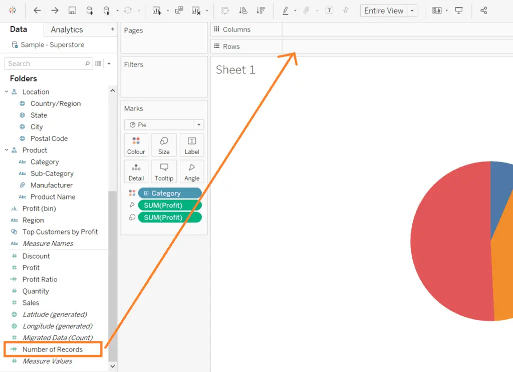
Secondly, create another copy of the “Number of Records” measure and place it on the Rows shelf. You can do this using a simple trick – by holding control on the “Number of Records” measure pill you have place on the Rows shelf and dragging it beside the original pill in the Rows shelf. This function creates a copy, keeping the original pill.
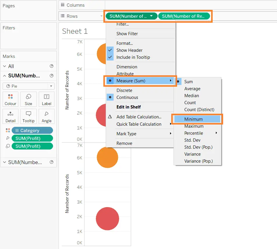
Thirdly, right-click on the Number of Records pill in the Rows shelf and change the Measure(Sum) to Minimum. Repeat this for both pills in the Rows shelf. Have a look at the screenshot below for reference.
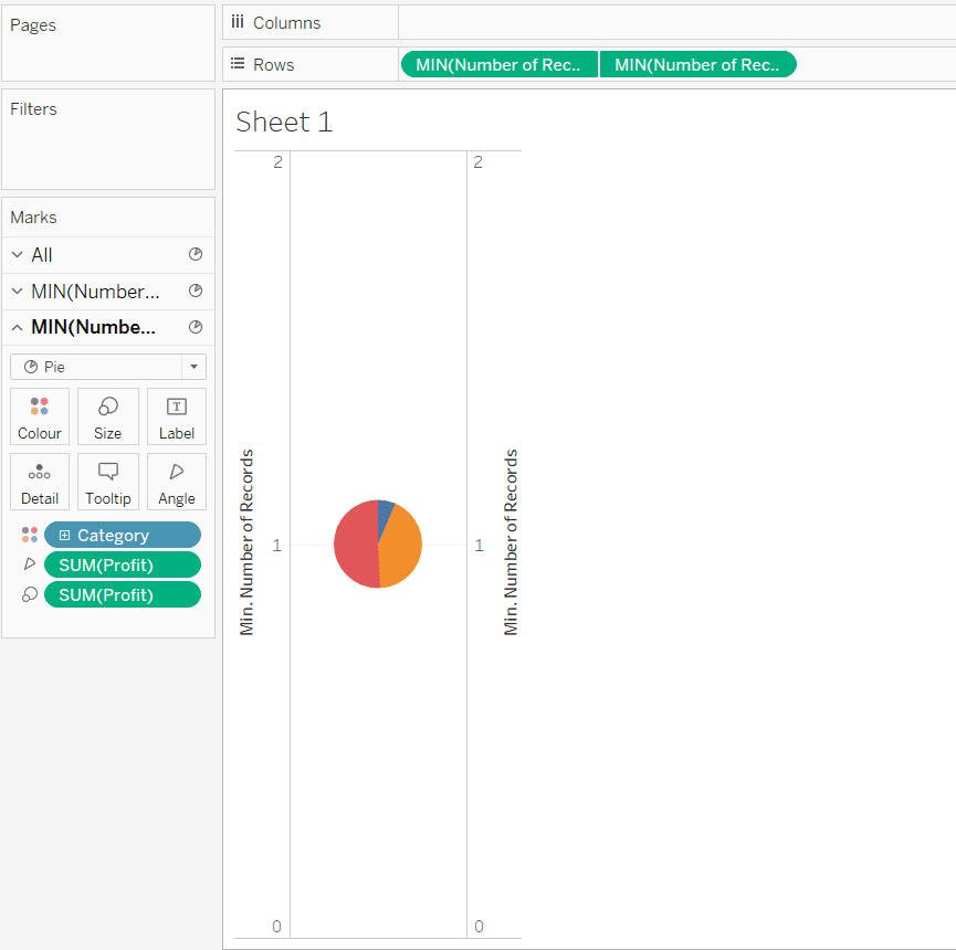
Finally, take the right-most pill in the Rows shelf and drag it to right of the pie chart visualization until you see a green rectangle and a black dotted line. This indicates the option to combine the two measures on a Dual Axis. Alternatively, you can right-click the right-most pill and select “Dual Axis” on the dropdown. This would create two overlapping Pie Charts.
5. Modifying the Second Pie Chart into a Hole
Next, the following step will convert the second Pie Chart into a regular circle, which will function as a hole for our “donut”. This involves removing all categorical data and profit values from the second chart.
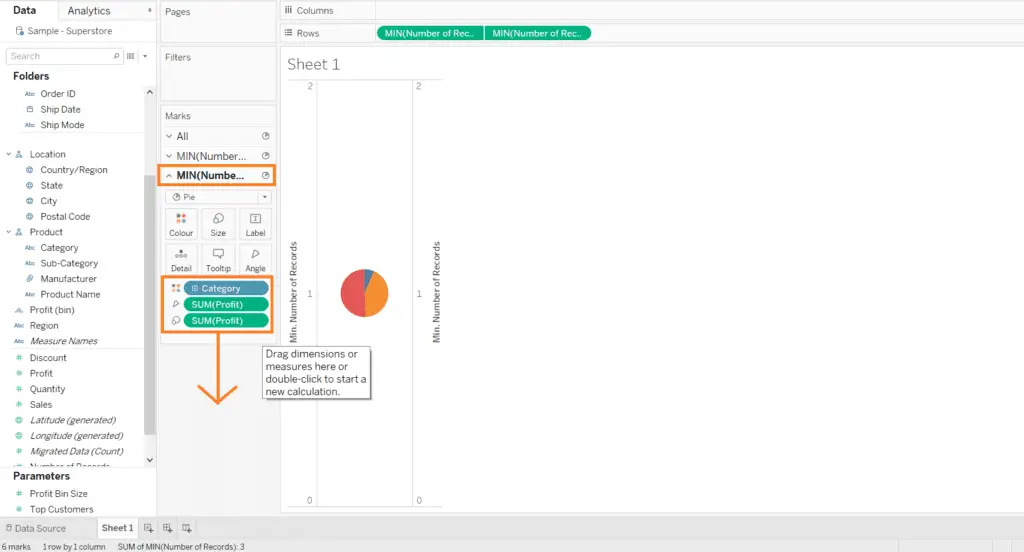
To carry out this step, simply navigate to the second pie chart (usually the one that appears below) in the Marks card on the left-side of the sheet and drag out all the pills within the card. In the case of my example, I removed the “Category” color pill, “Sum(Profit)” angle pill and the “Sum(Profit)” size pill by dragging them out of the card.
Here’s an example of what I would see on my screen. The important details are boxed up in orange, so do take note of them.
Once you have removed the necessary dimensions and values from the second pie chart, you should see a circle that’s greyed out. But not to worry! This is only because the second pie chart is currently completely overlapping the first one underneath. To overcome this issue, we can just simply adjust the sizes of each pie chart. Select on the first pie chart and adjust the size to make it larger and make the second pie chart smaller using the same method.
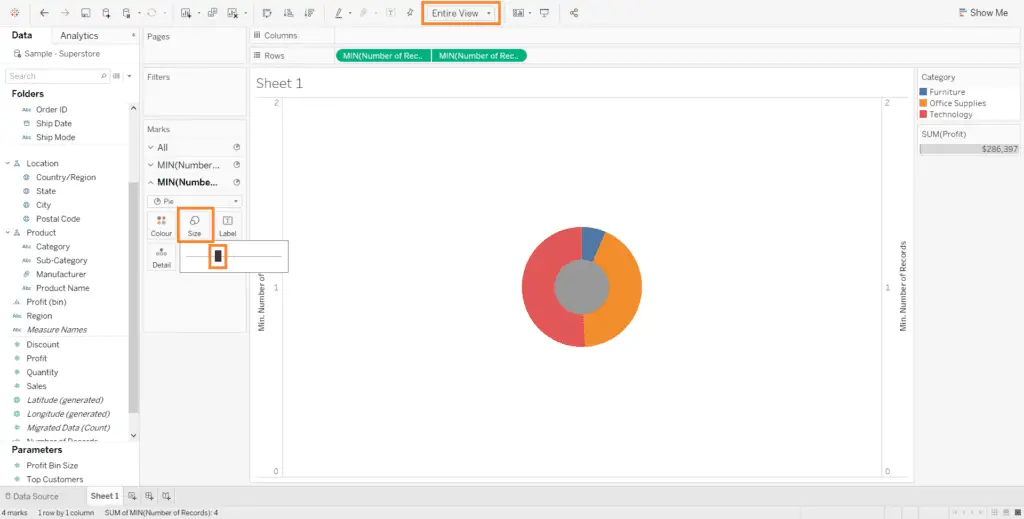
This Donut Chart should be a result of what you’ve done so far and should be what you’re seeing on your screen by now! It’s starting to resemble a donut, doesn’t it? I’ve adjusted the size of the two different pie charts by dragging the size slide on the Marks card. In addition, I’ve also adjusted the view of the chart by switching to “Entire View” from the default “Standard” view. This view can be changed clicking the dropdown at the top of the toolbar at the top of your screen.
6. Cleaning up your Donut Chart
With most of the technical steps done, it’s time to take a breather because the toughest parts are over. As it is now, our donut chart still looks very much unpleasant and needs to be properly cleaned and arranged. Here are some of the simple steps you should take to make your chart more presentable.
- Change the color of the second pie chart (the “donut hole”) to white by right-clicking the MIN(Number of Records) pill in the Rows shelf
- Remove both axis for a cleaner chart
- Synch both axis to have the same scale
- Add data labels for categories and their profit values
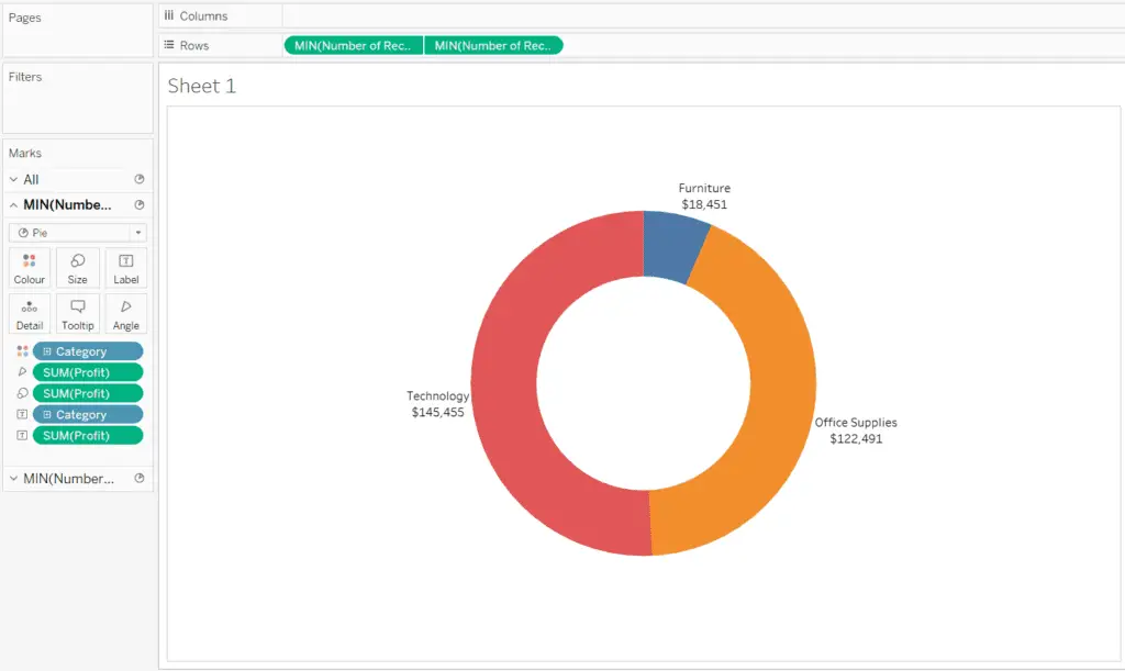
Then, once you’ve made these changes, this is what you should arrive at for your Donut Chart! Congratulations, you’ve just learnt to create your first Donut Chart in Tableau.
Additional Points on Donut Charts
Although seemingly attractive to the user, Donut charts are not as intuitive and useful as you think they are. As they are limited to showing the relative proportions of different categories in a whole, they are not as flexible. They do not provide an easy comparison between categories that do not have large proportion differences between them. In this scenario, you would be better off using a bar chart, where each bar will have the same starting point to compare lengths.
Moreover, the Donut chart can be confusing and counter-intuitive if there are more than 3 categories (in my opinion) and can be really distracting. This will prevent any data from being presented in a clear manner.
However, Donut charts might still serve as a better alternative to the Pie Chart. The Donut chart opens up space within the middle of the circle, allowing for an additional field or data value to be added according to the need.
Ready to learn more about Tableau, check out this list I put together of 7 clever ways to learn Tableau!
Final Thoughts
In my opinion, considering the possibilities of use for the Donut chart, I would personally advise against using Donut charts with too many categories or when comparing them. But of course, that would be my opinion and the decision is entirely up to you if you need to represent to your data in a certain way.
Conclusion
To conclude and summarise, a Donut chart is not a readily-made chart available in Tableau, but its likeness can be recreated using Pie Charts in Tableau. Also, Donut charts provide more space for data fields to be added to a chart as compared to a Pie Chart. Donut charts, however pleasant looking, might not be the best for a clear representation of multiple categories with little difference.
Thanks for reading this post! If you’re interested in Tableau-related content, you can check out more of my articles/tutorials on Tableau.
My Favorite Learning Resources:
My Recommended Learning Platforms!
| Learning Platform | What’s Good About the Platform? | |
|---|---|---|
| 1 | Coursera | Certificates are offered by popular learning institutes and companies like Google & IBM |
| 2 | DataCamp | Comes with an integrated coding platform, great for beginners! |
| 3 | Pluralsight | Strong focus on data skills, taught by industry experts |
| 4 | Stratascratch | Learn faster by doing real interview coding practices for data science |
| 5 | Udacity | High-quality, comprehensive courses |
My Recommended Online Courses + Books!
| Topic | Online Courses | Books | |
|---|---|---|---|
| 1 | Data Analytics | Google Data Analytics Professional Certificate | – |
| 2 | Data Science | IBM Data Science Professional Certificate | – |
| 3 | Excel | Excel Skills for Business Specialization | – |
| 4 | Python | Python for Everybody Specialization | Python for Data Analysis |
| 5 | SQL | Introduction to SQL | SQL: The Ultimate Beginners Guide: Learn SQL Today |
| 6 | Tableau | Data Visualization with Tableau | Practical Tableau |
| 7 | Power BI | Getting Started with Power BI Desktop | Beginning Microsoft Power BI |
| 8 | R Programming | Data Science: Foundations using R Specialization | Learning R |
| 9 | Data Visualization | – | Big Book of Dashboards |