
This post may contain paid links to my personal recommendations that help to support the site!
Do you need to create a pie chart for a project but don’t know how to make one in Google Sheets? Don’t worry, I’m here to help!
In this blog post, I’ll showfive easy stepsu how to make a pie chart in Google Ssteps. Pie charts are a great way to visualize data, and with Google Sheets, they are easy to create.
Let’s get started!
Here are the 5 general steps to making a pie chart in Google Sheets:
- Insert Data with Numeric Values Into a Google Sheet
- Arrange the Data in a Column Range and Select It
- Go to the Toolbar Click and Insert > Chart
- Choose the Type of Pie Chart You Want to Create (donut, regular, or 3D)
- Modify Labels and Values and Customize Chart Styles
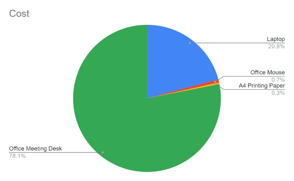
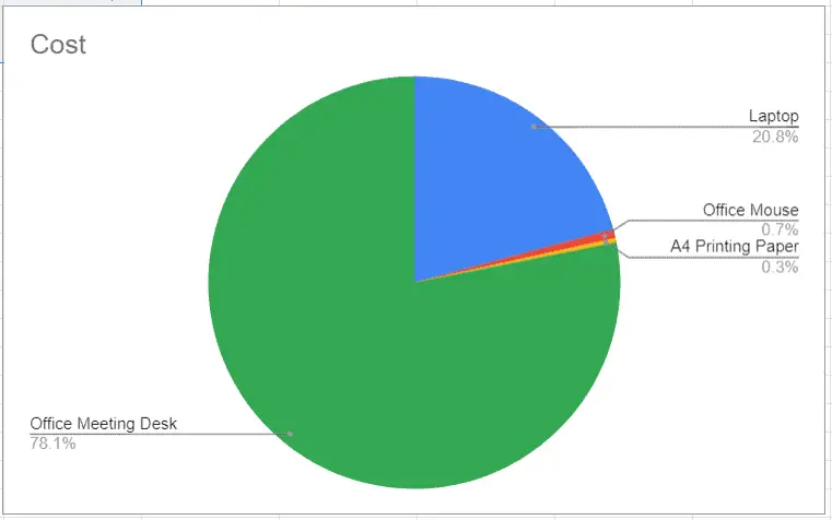
If you follow these steps, you’ll get a simple pie chart like this:
Let’s have a deeper look on how you can create pie charts in Google Sheets!
Step #1: Insert Data with Numeric Values into a Google Sheet
To create a pie chart, you need data that is organized into a column range. The first step is to insert your data into a Google Sheet.
You can do this by manually entering the data into the cells or pasting it from another source, like an Excel spreadsheet. Just make sure that one of the columns has numeric values.
To enter data manually, click on a cell and type in the value. To paste data from another source, click on the cell where you want to start entering the data and then paste it using Ctrl + V (Windows) or Cmd + V (Mac).
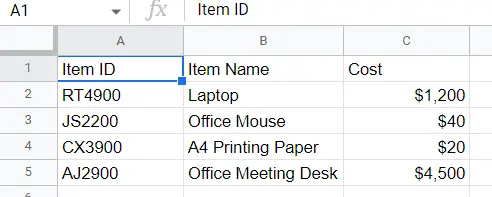
In this example, I’ll be using some sample data I created below.
Once your data is imported into the Google Sheet, move on to the next step.
Step #2: Arrange the Data in a Column Range and Select It
Now that your data is in the Google Sheet, it’s time to arrange it into a column range. A column range is a group of adjacent columns that contain related data. Ensure that the categorical values (Type) are arranged beside the numerical values (Cost).
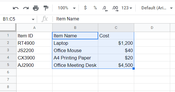
Once the column range is arranged, it’s time to select it. Selecting the column ranges tells Google Sheets which values you’d like to plot the pie chart on.
To select a column range, click on the first cell in the column and then drag your mouse over to the last cell. In this example, I’m going to select columns B to C.
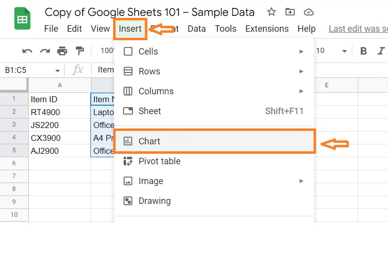
Step #3: Go to the Toolbar and Click Insert > Chart
With the column range selected, it’s time to insert the pie chart. To do this, go to the toolbar and click Insert > Chart.
You should see an auto-generated chart. This can be different based on the suggestions made automatically by Google Sheets. Move on to the next step to ensure you get a pie chart.
Step #04: Choose the Type of Pie Chart You Want to Create (donut, regular, or three-dimensional)
After inserting a chart based on your selected column ranges, you’ll want to make sure you end up with a pie chart.
To do this, click on the chart and a chart editor panel should appear on the right of your screen. Click the Chart Type button in the editor panel.
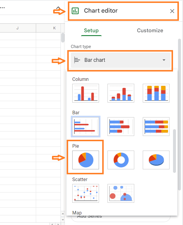
IMAGE
A drop-down menu will appear with different types of charts. Select Pie chart from the list.
You should now have a basic pie chart! If you want to change it up a bit , you can choose from different types of pie charts. To do this, click on the Chart Type button again and select a different type of chart from the list.
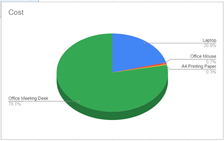
There are three types of pie charts: donut, regular, and three-dimensional. I’ll go over each one briefly so you can decide which type of chart is best for your data.
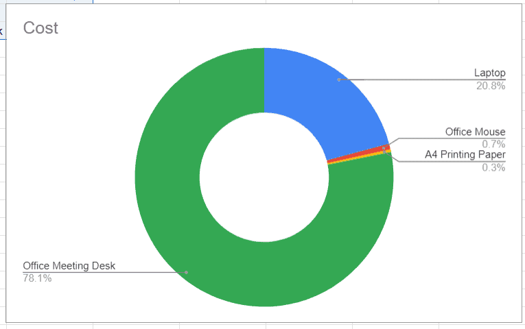
Donut Pie Chart: A donut pie chart is similar to a regular pie chart, but with a hole in the center. This type of chart is best used when you want to compare parts of a whole.
Regular Pie Chart: A regular pie chart is the most basic type of pie chart. It is best used when you want to compare parts of a whole and the total value is 100%.
Three-Dimensional Pie Chart: A three-dimensional pie chart is similar to a regular pie chart, but with a third dimension (depth). This type of chart is best used when you want to compare parts of a whole and the total value is less than 100%.
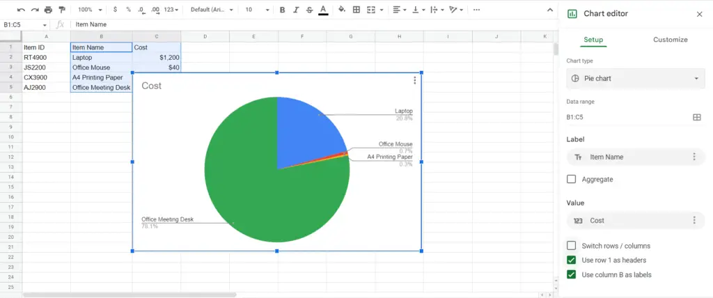
For this example, I’m going to choose the regular pie chart. I personally like the regular pie chart the most for its simplicity.
Final Pie Charts Example in Google Sheets
Step #05: Customize Your Pie Chart (Optional)
After you’ve selected the type of pie chart you want, it’s time to customize it. Customizing your pie chart allows you to change the colors, add or remove data labels, and more.
To customize your pie chart, click on the Customize button in the editor panel.
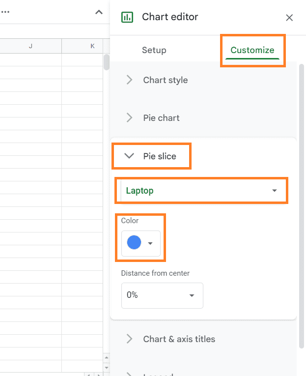
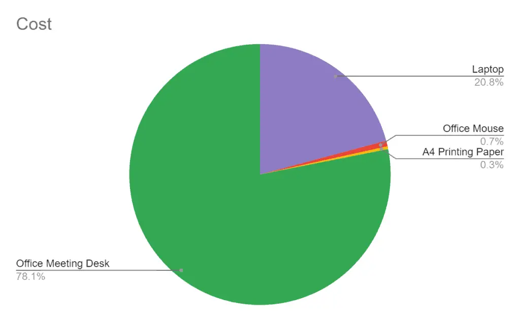
A menu will appear with different options for customizing your pie chart. For this example, I’m going to change the colors.
To change the colors, select the Pie slice button. Click on the slice categories and choose a color for each of them. In this case, I changed the Laptop category pie slice to purple.
Final Thoughts
And that’s it! You’ve now successfully created a pie chart in Google Sheets. I hope this blog post was helpful. Thanks for reading!